 We’ve been browsing local small business websites these past few months. We found some beautiful classy ones, some funky animated-boxes-popping-up-everywhere ones, some dodgy broken-link-galore ones…
It’s been an educational experience as we look at each one with a critical eye, and you know what? We learned that an effective website isn’t all about fancy design and pretty pictures. Of course, people tend to gravitate towards eye-candy, but if they have to wait fifteen minutes for the images to load or click multiple guesses before getting to the page they want, you’re likely to lose their patience and business.
So we thought about what we think make a small business website effective, and here’s what we came up with:
1. Intuitive navigation with straight-forward menu running across the top that stays up there wherever you are on your site. This menu should include all the links you want to direct your visitors to, such as your products and/or services page. Don’t forget to include ‘Home’ in the menu so visitors can always find their way back if they get lost.
2. Remove clutter of text and images. If you use pretty images on your homepage, make sure they click somewhere you want to direct your visitors to, such as your products and/or services page. Don’t write an essay about why they should connect with you, tell them in one paragraph. If your services are complex, summarise it with an infographic.
3. Consider your website objective and have this translated into a simple ‘Call to Action’ button. If you want your visitors to contact you, have the ‘Contact Us’ button displayed clearly on the homepage–preferably somewhere at the top where people don’t have to scroll to find–or on the sidebar of every page.
4. Use readable font, big enough for even your great great grandpa to read. Make sure there’s enough space between text or you’ll get your visitors in tears like they have just chopped a thousand onions and that’s not good.
5. Use colour strategically. The overall theme should complement your brand and be consistent with your marketing materials and/or shop design. There’s nothing worse than discovering you’re accidentally promoting your competitors’ brand online.
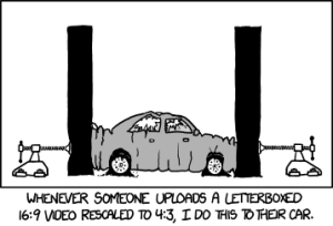
6. Invest in professional photography. Websites with blurry images–or worse: incorrect aspect-ratio that squashes everything–are a straight-forward no no.
7. Make sure your website is up-to-date! We know you may be busy running your business, but by God don’t let your customers astray by sending them to your old shop on the other side of the bridge. If you have moved or updated your offerings, make sure your website reflects the correct info.
8. Convert to a mobile-friendly design that automatically adapts to whatever device your visitors are viewing it from. People are always on-the-go these days, they do shopping on the bus or find your location while walking and enjoying their morning coffee. Asking them to zoom to click the links isn’t an option anymore. Or worse, this could happen….

If you already have a website, we offer you a free evaluation on your current set-up. Take advantage of this offer and get in touch! We would love to help you.
Author: Lydia Kurnia
