 Being a mother of an eleven-year-old, I’ve had to learn ways to get him to help out with housework. Words like “Let’s get busy!” when it’s time to unload the dishwasher works better than “Do it now!” Just casually mentioning the new Coconut chocolate we just bought would send him running to fetch the box for me while “Get me a chocolate!” would only result in a shrug. It’s all in how you say it.
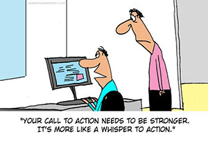
And the same with the ‘call-to-action’ elements on your website. Call to action buttons can serve a variety of functions, but its main purpose is to get your website visitors to do something. That something could be buying a product, downloading an eBook, requesting information, or whatever your website goal may be.
How you say and what you say in relation to the content is very important, but using the right words and representation for your ‘Call to action’ button is crucial.
Getting prospective customers to do what you want them to do can be like herding cats. They abandon shopping carts before checking out, they don’t sign up to your helpful newsletters, they don’t even read your blog posts all the way to the end (… and how do I know this? you ask. Well the bounce rate on Google Analytics told me – but that’s for next time).
So how do you get your prospects to do what you want? Include a compelling ‘call to action’. 5 points to look out for when designing an effective call-to-action:
- Make your call-to-action buttons irresistible. Pay attention to the size, shape, and colours. Your reader should feel compelled to click it because Ooo… so shiny!
- Find an optimal position to put your call-to-action button. The rule of thumb is top for simple offering and bottom for complex offering. Give your reader a chance to digest the information and make an informed decision so when they arrive at the bottom of the page, they’re ready to click that button.
- Use words that encourage immediate action. When your call-to-action gives visitors reasons to act immediately, they’re more likely to follow through. Use “Buy Now” instead of “Add to cart”. And give a deadline where possible.
- Tell your reader the benefits from taking the action now.
- Give your ready clear and specific instructions so they know what they’re getting into.
Remember, if you speak your prospective customers’ language, you can get them to do pretty much whatever you want.
If you want us to help you optimise your ‘call-to-action’ elements, get in touch. We’ll be happy to help.
Author: Aivy Turner
